We support our Publishers and Content Creators. You can view this story on their website by CLICKING HERE.
Absolutely nothing is going right for the Philadelphia 76ers — not even their social media graphics.
The Sixers got thumped by the Los Angeles Clippers at home on Sunday. And after the game, as is customary, the social media team posted a graphic on social media that displayed the final score, 125-99.
But it didn’t take long for fans to notice that an unfortunate font choice made “Final” look more like, well, another word.
Take a look:
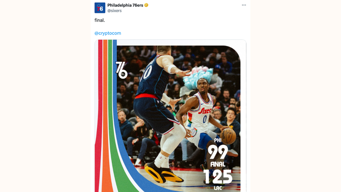
In a since deleted post on X, the Philadelphia 76ers had a graphic design faux pas.
(X: @sixers)
Oof.
I see the vision. The designer was going for a retro look to match this year’s City Edition jerseys. These uniforms are a tribute to the Spectrum era, when the 76ers played at the iconic arena from 1967 to 1996. The font is a variation of the Sixers wordmark from the mid-1970s.
But maybe they could have put an extra space between the F and the I. (Designers call that “kerning.”) And we won’t even mention Tyrese Maxey’s cotton candy hair.
The post had garnered millions of views and thousands of re-posts and comments — all of them making the same observation. Late Monday morning, the team deleted the tweet. But it was too late.
It’s a tough look for a 76ers team that has started the season in disastrous fashion. The blowout loss dropped Philadelphia to 3-13 on the season — just one game ahead of the league-worst Washington Wizards. And injuries to Philly’s star players Paul George and Joel Embiid aren’t helping.
On the bright side, though, their social media engagement is off the charts today!

 Conservative
  Search
 Trending
 Current News