We support our Publishers and Content Creators. You can view this story on their website by CLICKING HERE.
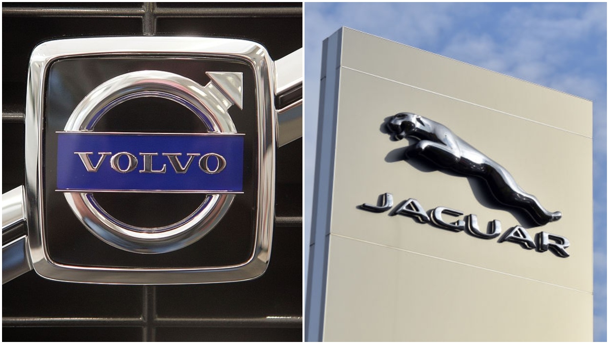
Far be it from me to tell those Madison Avenue fat cats how to do their job, but I’m pretty confident that Jaguar unloaded the worst commercial of all time earlier this week, and I’m even more sure of that after the folks at Volvo asked us to hold their proverbial beer so they can show us all how it’s done.
If you missed it, we talked about Jaguar’s newest little ad in Nightcaps the other day (which some are calling one of history’s great substitute Nightcaps performances; their words, not mine… okay, they’re mine), but you can get a look at it right here too.
If you’re confused, that was Jaguar, the luxury sports car brand, letting everyone know that they’ve told their cool old logo to hit the bricks in favor of a lame new one.
But it’s not even clear that that was an ad for cars. It could have been for pretty much anything but cars. There wasn’t even a car in it!
The only thing that would have been a worse idea would have been if they included a car, but it was a Jaguar F-Type with Dylan Mulvaney’s mug plastered across the side of it.
*Shudders*
Pretty much everyone has been ripping on this ad because of the way it thought it was being artistic and boundary-pushing when in reality it was just the Jaguar marketing people sitting in a room sniffing their own farts.
Let’s Let Volvo Show Us All How It’s Done
Now, in light of this, McDonald’s marketing director Guillaume Huin tweeted out a video that was originally posted on Volvo’s Instagram back in September.
It’s a 3-minute, 46-second short shot by the cinematographer Hoyte Van Hoytema who has worked on Christopher Nolan flicks like Oppenheimer and Interstellar.
That sounds like it would be way too long and way too highfalutin, but as Huin pointed out, Volvo stuck the landing on this one, while Jaguar ended up making Target’s infamous tuck-friendly swimsuits look like a good idea.
How about that? Need some Kleenex?
I don’t know about you, but I might go test-drive a Volvo tomorrow. I’m not even in the market for a new car, I’m just a staunch advocate of expectant mothers being able to use crosswalks without getting clobbered by vehicles, and it would appear Volvo is too.
I like that.
But joking aside, that ad would clean up at festivals. It had the emotional impact and the twists and turns of a feature film in under four minutes. Unreal.
Volvo’s spot did everything Jaguar tried to do but was frankly too lazy to accomplish.
It was shot artistically. It told a story. It was powerful and sent a message that sticks with you.
Volvo did this with masterful storytelling, acting, and production.
Jaguar tried to do it with bright colors, gender fluidity, and goofy haircuts.
And, on top of that, Volvo remembered to include — get this — THE CAR THEY WERE TRYING TO SELL and did it in a way that makes sense.
Bravo, Volvo; or, as they say in the brand’s native Sweden, “Bravo.”
Take note, Jaguar; this is how you get creative with your ads without coming across like out-of-touch doofuses.

 Conservative
  Search
 Trending
 Current News
